FARFETCH CONTEXTUAL MESSAGING TOOL
PROJECT:
Contextual Messaging tool
CLIENT:
Farfetch
DATE:
H2 2020
SKILLS:
Stakeholder Workshops
Task Analysis
Service Mapping
OOUX Modelling
State Transitions Mapping
Concept Generation
Figma UI Design
User Testing
Engineering Support
CLIENT ARTICLE:
SUMMARY
During the period of 2018-2019, I had the opportunity to work on various design projects, including a new promotions tool, for Farfetch’s Marketing vertical. Six months later, I was approached to contribute to another project involving the creation of a Contextual Messaging tool. From the latter half of 2020 to early 2021, I spearheaded the design of an integrated multi-channel solution. Regrettably, due to an impasse on terms of an extension, I had to depart the project before its completion.
The project was remarkable in terms of its size, complexity, governance of the marketplace, and its significant impact on the business. To meet the requirements of all users, advanced design modelling techniques were employed.
The implementation of the Contextual Messaging tool successfully resolved various pain-points in the end-customer experience. Consequently, this led to a notable increase in order values, as detailed in the following Farfetch blog post:
INTRODUCTION
Farfetch had long faced limitations in its on-site and in-app marketing campaign activities due to inadequate software. As a part of my previous work with Farfetch, I designed a promotions configuration and management tool. However, the communication of promotions to customers at that time relied on a fragmented ecosystem of channel-specific CMS widgets and unofficial customizations of third-party software.
These disparate tools lacked uniform capabilities and performance attributes, with no tracking or personalization features. The configuration process was cumbersome, often taking users entire days to set up a campaign due to the software’s instability and inability to handle the extensive content permutations involving audience, language, and currency.
The objective of the new tool was to enable users to easily create campaigns that could deliver bespoke messages to specific audiences, in specific contexts, at specific moments. These messages would be presented on designated touchpoint modules in the customer experience (such as a Banner POS module) and consist of rich text, icons, imagery, and buttons, among other elements.
Throughout the project, I primarily collaborated with two product managers (PMs) and two engineering teams, divided between the development of the tool and the necessary updates to the platform services.
RESEARCH
Upon joining the project, I conducted in-depth interviews with our primary users from the Marketing Production and Loyalty teams. Additionally, I observed internal staff training sessions. It quickly became evident that the existing suite of tools was unreliable, inefficient, and a source of frustration. The configuration journeys were laborious, repetitive, and reliant on a single user.
To better understand user needs, I analyzed and documented the recordings of these interviews and sessions in Airtable. I also created a glossary of terms to enhance alignment across users and internal teams. To facilitate research and create a foundation, I developed a draft service map outlining a golden path for campaign creation, identifying users, tools, pain points, and unknowns. This map underwent multiple iterations in collaboration with users to achieve an accurate representation of the existing process. Additionally, I created several “to-be” maps to explore different approaches for handling translations, which were refined at a later stage.
Subsequently, I conducted interviews with stakeholders from Linguistic Services, gaining insights into their workflows and receiving a demonstration of their translations CMS (XTM).
During the discussions, it was evident that they were frustrated with the current process, as writers were unable to test and validate their own content. All configurations had to be done by a single Marketing user. If content failed for any reason, a new SLA would be required for writers to amend the content, making the process inefficient and circuitous.
An essential business driver behind prioritizing this project was the cost of the annual subscription to Qubit and the agency engaged to augment its functionality. I conducted an initial usage survey among all Qubit-registered users within Farfetch and followed up individually to understand specific use cases that might be affected by transitioning away from Qubit.
From the survey, I identified approximately 20 active users out of 180 registered, unearthing interesting use cases in Product Marketing, Media Solutions, and Brazil. For instance, Product Marketing needed the ability to promote a campaign on a different channel from that of the linked promotion, allowing them to offer a promotional discount on first purchase through the mobile app but only communicate the promotion on the web. These cases were recorded and later utilized for testing the model.
OOUX MODELLING
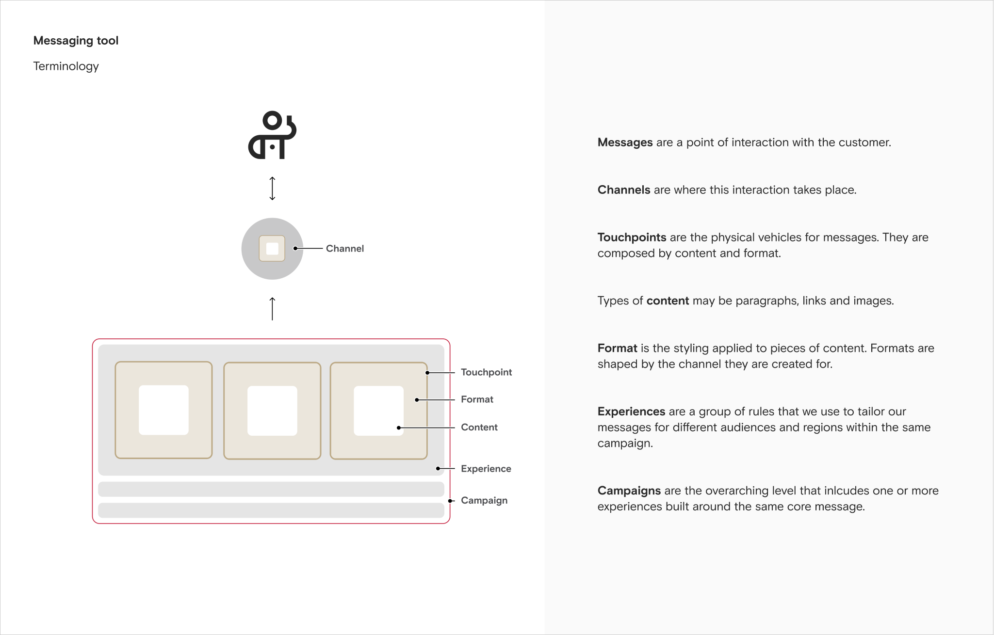
To gain a comprehensive understanding of the domain, facilitate discussions with stakeholders, and comprehend their mental models, I organized the glossary as an object model. This model was iterated with users, product managers, and engineers. I explored various options, particularly concerning whether a “campaign” should be treated as a grouping of “experiences” or as an independent object.
Although modelling “campaign” as a grouping parameter could simplify the main dashboard interface, upon closer examination it became evident that this approach would not be viable. Some carousel touchpoints could display multiple campaigns on rotation, up to a maximum of three, and the order needed to be controlled. Similarly, for non-rotational touchpoints, a prioritization ranking was necessary to determine which campaign would be shown to a customer in a specific context if multiple campaigns were eligible.
As a result, each “experience” represented a configuration variant of a campaign, enabling the delivery of tailored messages to different audiences. Usually, experiences were configured to be mutually exclusive, ensuring that a customer would only be eligible to view a single experience of a campaign. However, there were use-cases that required multiple eligible experiences, such as content-variant A/B testing.
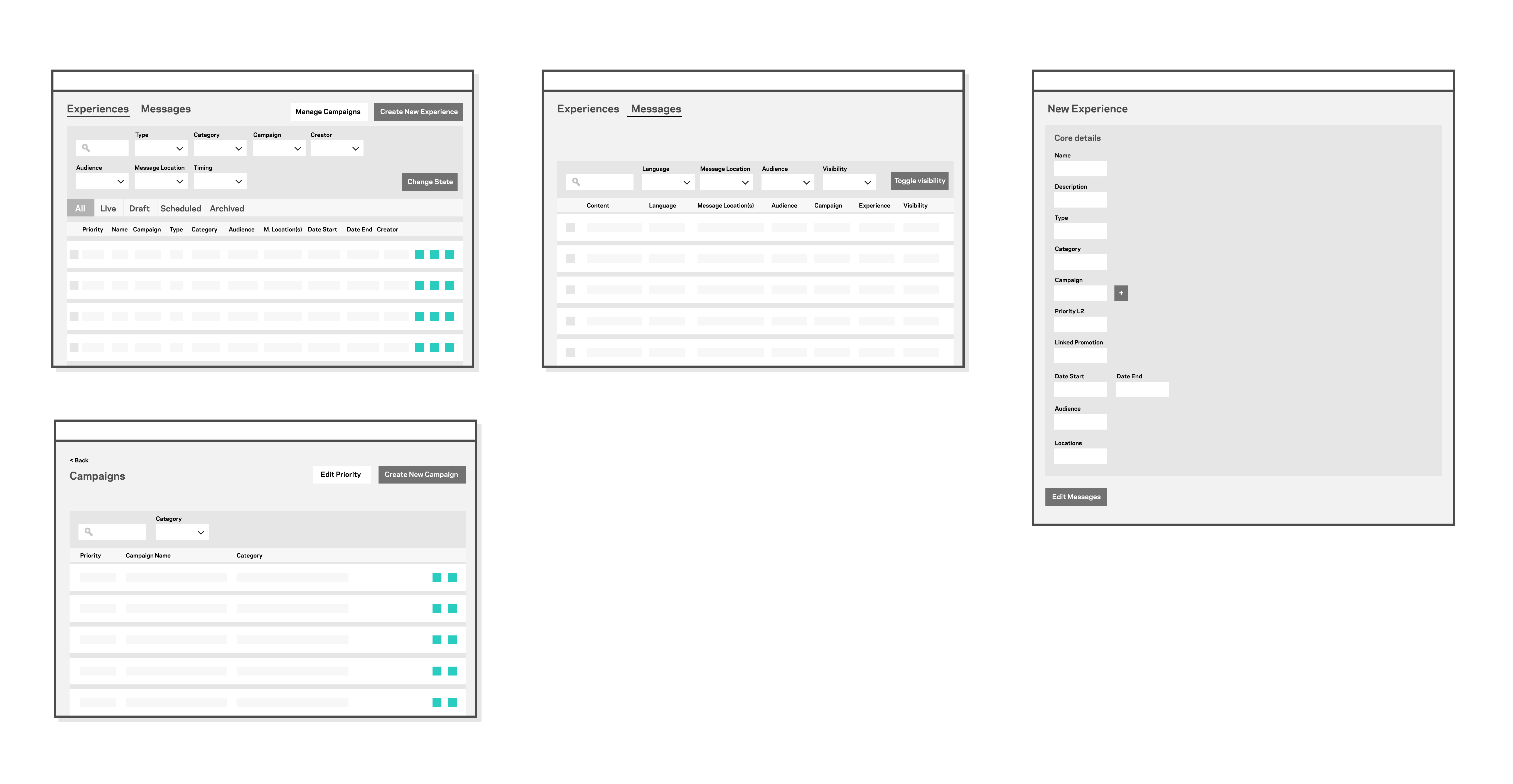
Users needed to configure the priority of experiences within a campaign and also rank campaigns, thus necessitating two high-level primary objects, each with an ordering mechanism. The selected model was successfully tested against user-provided edge cases, gaining the confidence of stakeholders, product managers, and the engineering team. It was agreed that with careful design decisions our approach would be user-friendly, empowering users to target specific messages to customers precisely, while also accommodating more complex campaign and promotion types in the future.
CONCEPTS
Simultaneously with object modelling I developed concepts and transferred them into Figma using a low-fidelity wireframe kit. However, it became evident during discussions that more advanced components were necessary. Consequently, I decided to switch to finishing the concept development using the full design system, while managing stakeholder expectations.
Once a complete concept journey encompassing all essential functionality for the MVP was agreed upon by product managers and stakeholders and engineering had sufficient information for estimation purposes, I collaborated with the product managers to divide the design stage into epics, allowing for semi-agile work with engineering. From there, I created stories in JIRA focusing on four main epics:
- Dashboard and campaign creation
- Experience configuration
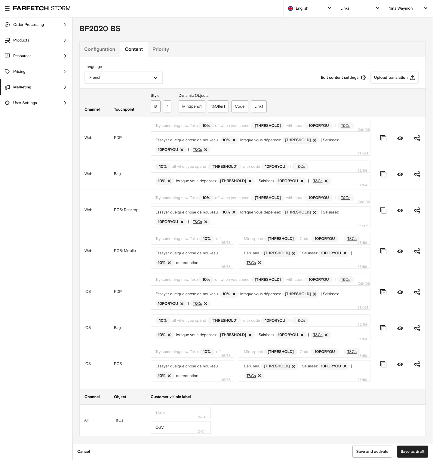
- Content writing and translations
- Testing and Activation
DESIGN
Each section was designed, iterated, reviewed with users, and tested against edge cases. Several supporting models were also created, including:
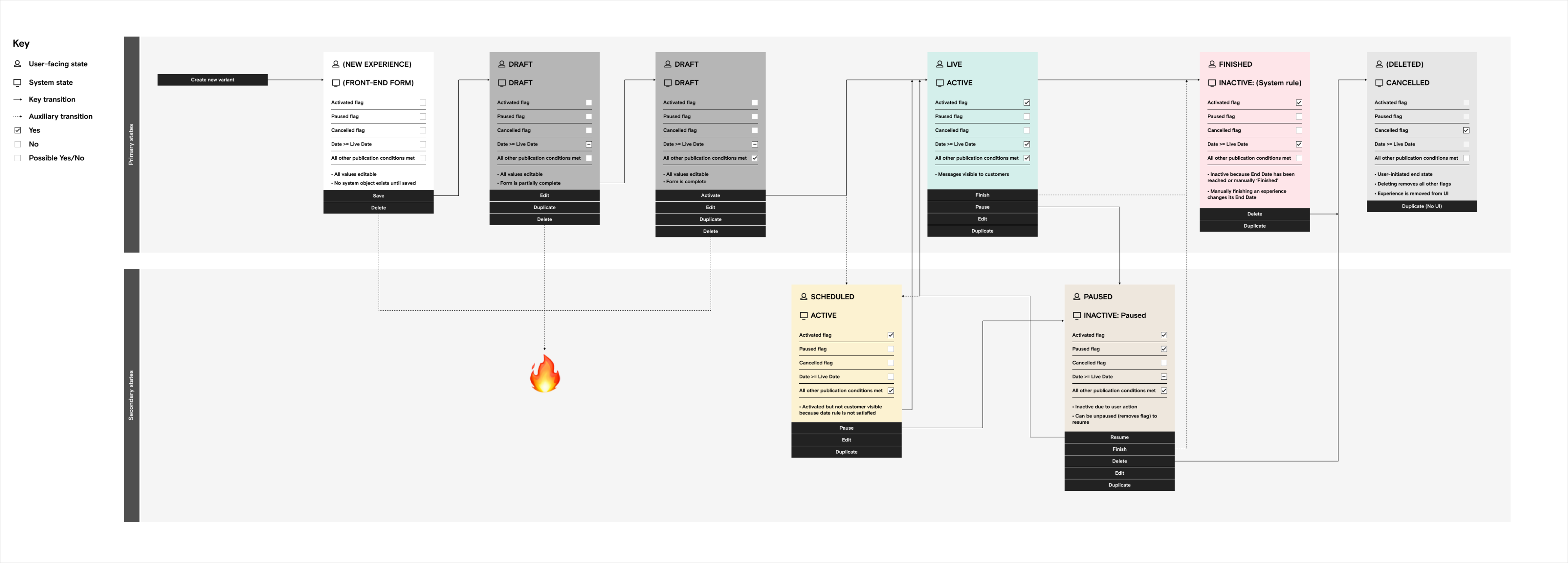
State transitions – Defining the state transitions for experiences, along with the associated conditions and actions, required collaborative work with engineers and users. Pathways and edge cases were traced out, and the process underwent multiple iterations to achieve consensus and address potential issues.
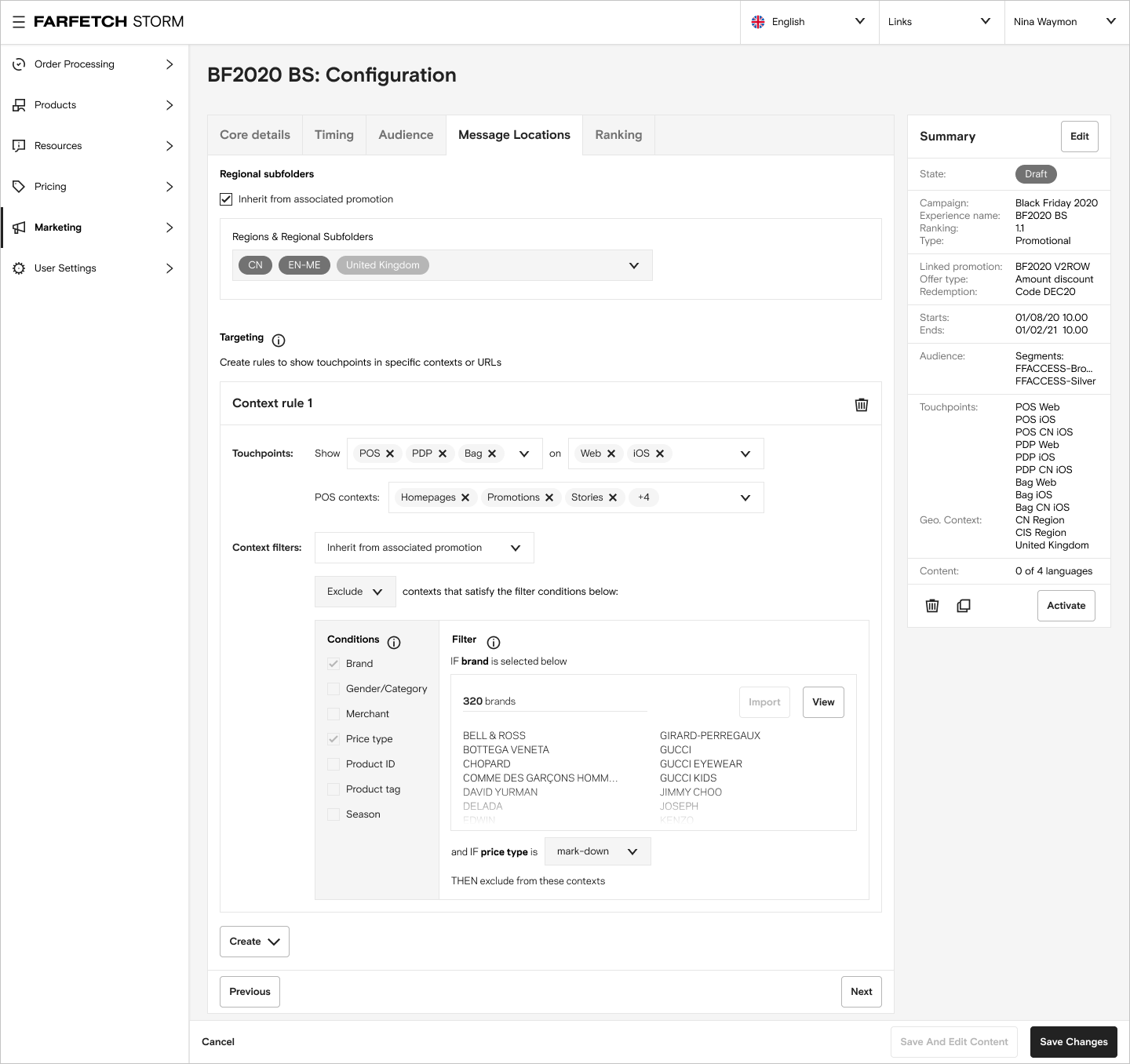
Context configuration – To enable users to define targeting rules for visibility on specific pages or screens, a comprehensive context configuration screen was necessary. This was especially crucial for promotional campaigns where messages needed to appear on product detail pages of eligible products but not on those of ineligible products. Drawing upon my prior experience designing the rules engine of the promotions tool, I ensured that the campaign management tool would automatically inherit the rules of a linked promotion, streamlining user workflows and minimizing human input errors.
In order to aid design of the context configuration screen and assist engineering, I mapped out the relationships between context types, touchpoint types, channels, and promotion tool product filtering parameters in Airtable. This table would show which contexts could be inherited automatically for a given set of promotions rules. As a contractor I had limited access to engineering resources but it gave enough to steer design, and would prove a useful resource for a BA to pick up at a later date and verify. A prototype flow was designed out showing a configuration journey.
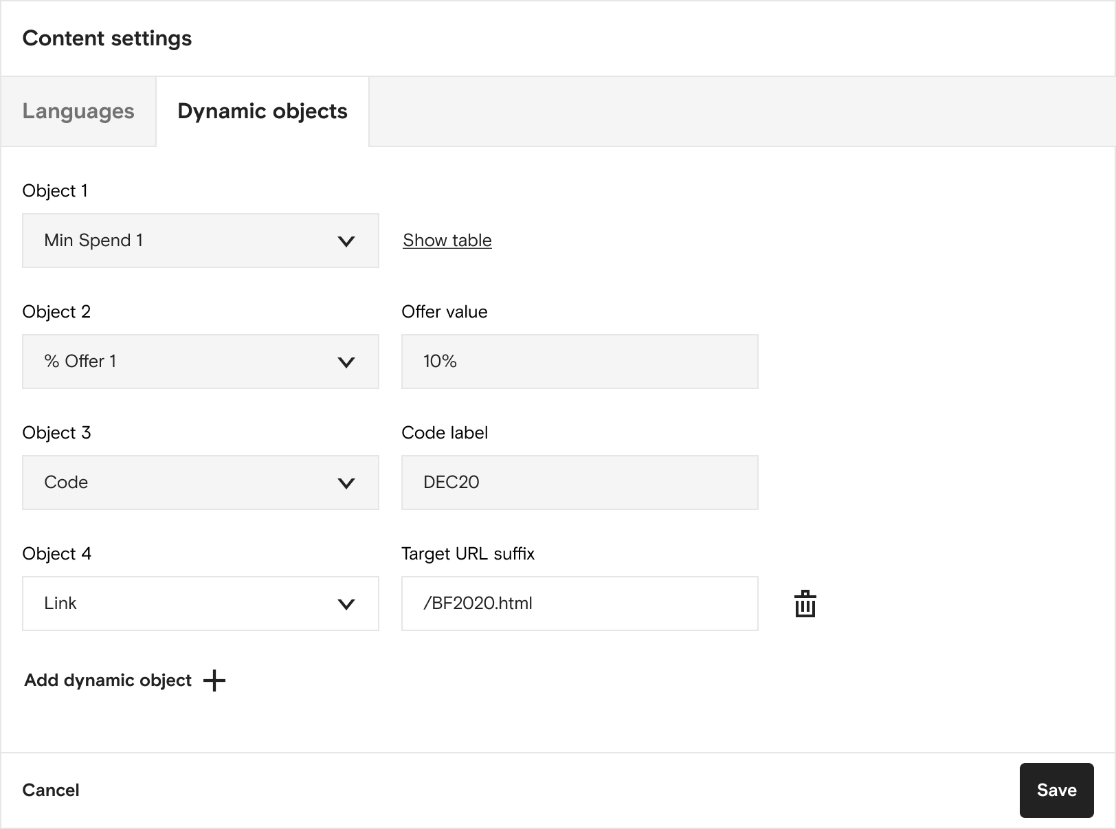
Dynamic objects – A significant efficiency gain in the concepts involved inheriting configuration data from a linked promotion, which could then be automatically pulled through into the content. To facilitate this, I introduced “dynamic objects” that users could insert into the content body during the authoring stage.
These placeholder objects, both textual and non-textual, presented various context-specific values in the on-site experience (e.g., fixed-discounts specified in multiple currencies). I mapped out the properties of each dynamic object type in Airtable and designed a configuration experience to support this functionality.
Translations workflow – Initially, the concept envisioned integrating the Contextual Messaging tool with XTM for translations. However, due to time constraints the decision was made to adopt a simpler approach using CSV export and import. I designed this workflow to assess any issues with dynamic object handling in XTM, identify workflow bottlenecks, and address potential sources of human error associated with multiple translation writers validating their content in the tool, as well as a CSV template.
HANDOVER
In the project’s final stages, internal upheaval and changes in personnel occurred, leading to the removal of both product managers, and a new PM took over. With limited time remaining, I worked diligently to package the design with annotations of outstanding issues and prepared comprehensive guided design handover documentation along with an onboarding document, which I presented to design managers.
A designer took over the work at a later date, and the project was successfully launched in late 2022.
For further details, you can find the Farfetch tech case study here:


