AVIVA SAVE SMARTER
PROJECT:
Save Smarter Web Tool
CLIENT:
Aviva
AGENCY:
Razorfish
DATE:
Q1 2016
SKILLS:
User Journeys
Sketch Wireframing
Justinmind Prototyping
LINK:
SUMMARY
In early 2016, Aviva launched a 3-phase global brand strategy titled “Good Thinking”, as it sought to communicate their ability to improve the lives of their customers. The second phase of this campaign related to savings behaviour and aimed to encourage consumers to reflect on their current actions and make incremental changes to save smarter.
The agencies involved proposed an integrated TVC, Print & Web campaign, with an online tool at the heart of it. The proposal was that this would consist of a self-discovery quiz on a microsite which would help users identify their financial personality and learn how they could save in a smarter way for the long term. The overall objective for the quiz was for it to be light-hearted in tone, but provide appropriate and engaging advice.
MY ROLE
This was a cross-agency project, working with Adam & Eve (TVC), Zenith (Media) & Goodboy (Development). I was the lead UX on the project, working alongside a visual designer & PM and overseen by a creative director. This was a design-execution project as the scope had been defined by Strategy and the Client by the time I had joined.
My activites involved creating user journeys, mobile-first wireframes and a high-fidelity prototype, all the while working agile with the development team. As it was one of many strands to the campaign, we were working to tight deadlines to ensure coordinated delivery.
USER JOURNEYS
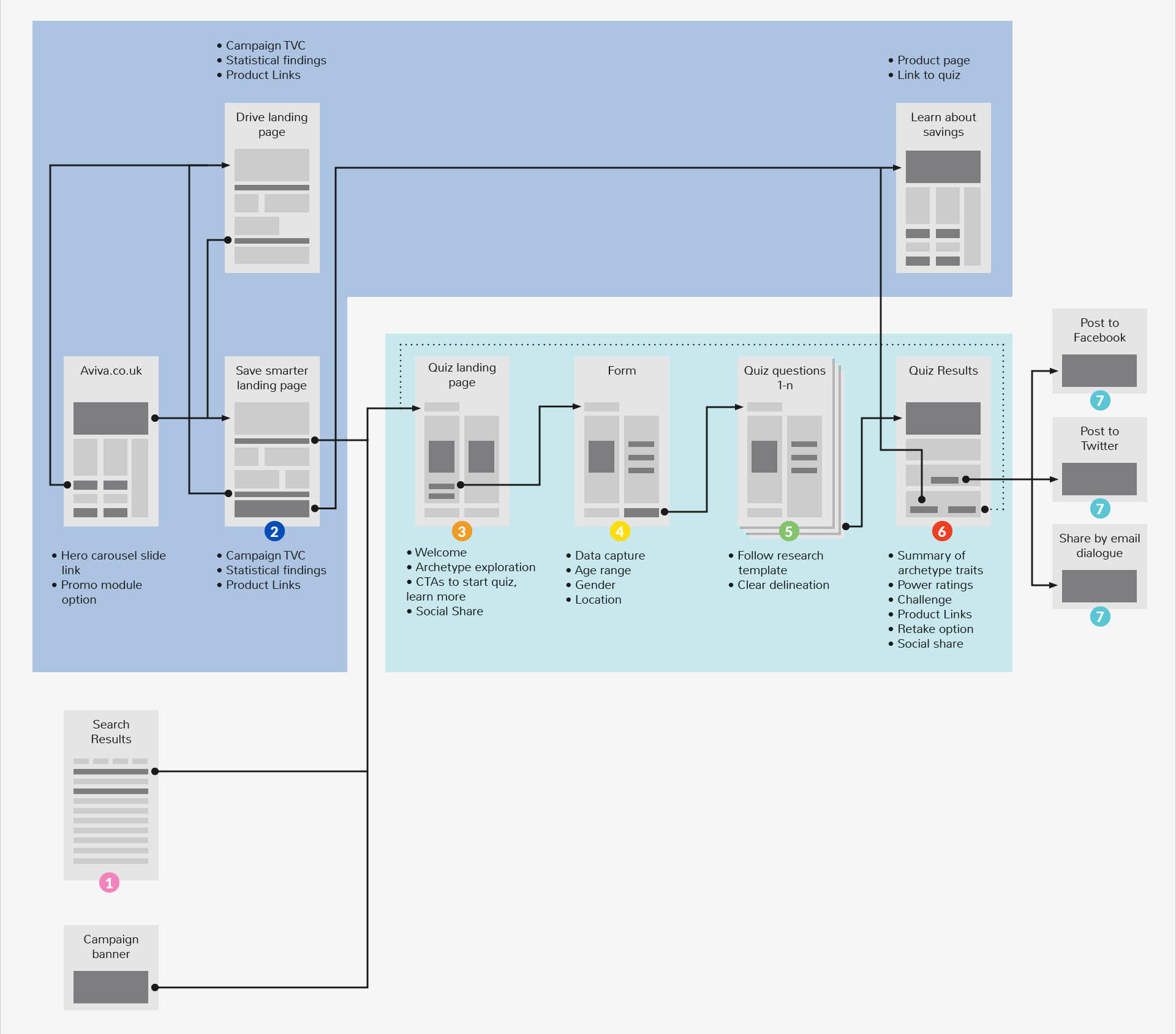
These allowed for varying entry points, repeat journeys and handoff to specific advice content upon completion.
WIREFRAMES
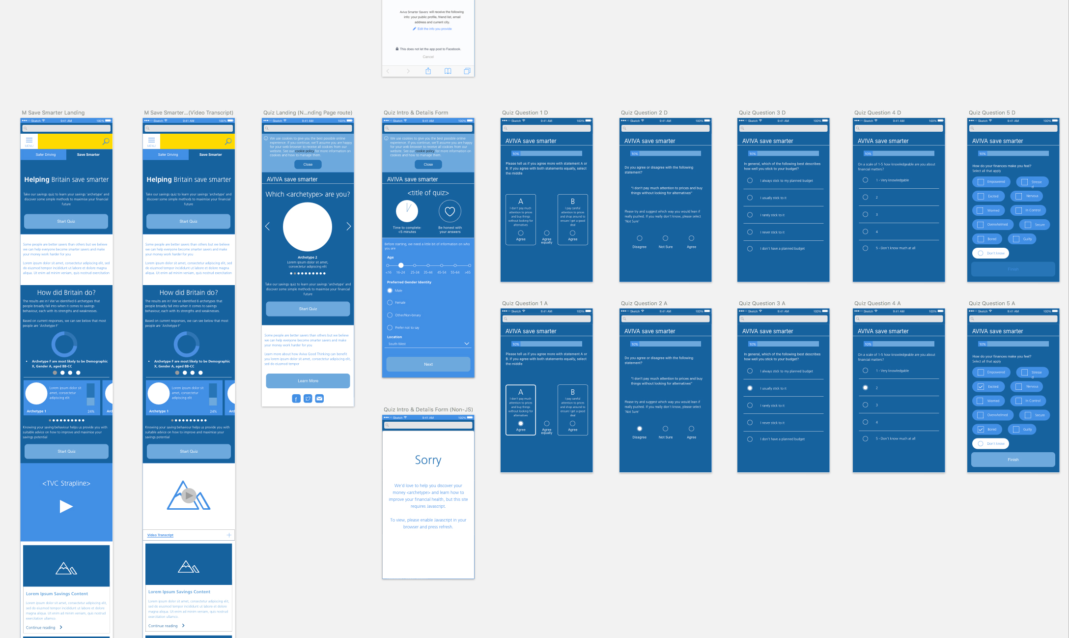
An external research agency had been commissioned to devise the quiz questions and characteristics of each finanical personality. As their algorithm required a large number of questions to achieve accurate profiling I was conscious of the potential for user dropout. I therefore focussed on increasing motivation to take the quiz (e.g. social proof) and ensuring the experience was frictionless (through simple interaction patterns)
PROTOTYPING
As the delivery deadline approached, it became apparent that the development team were struggling to code a working prototype in time to feature in the accompanying TV commercial. In order to safeguard against this, and as I had finished delivering wireframes for build, I set about creating a fully-functioning data-driven prototype using Justinmind.
There was a problem, however: the tablet model to be used in the commercial was unknown and hence the prototype had to be built height-fluid to cater for an unknown viewport size.
The TV commercial was to feature real families rather than actors taking the Save Smarter quiz, and as such we wanted to ensure that they received an accurate result at the end of the quiz to capture their reaction. To achieve this I built the logic of the quiz’s calculation and weighting of scores into the prototype using variables in Justinmind.
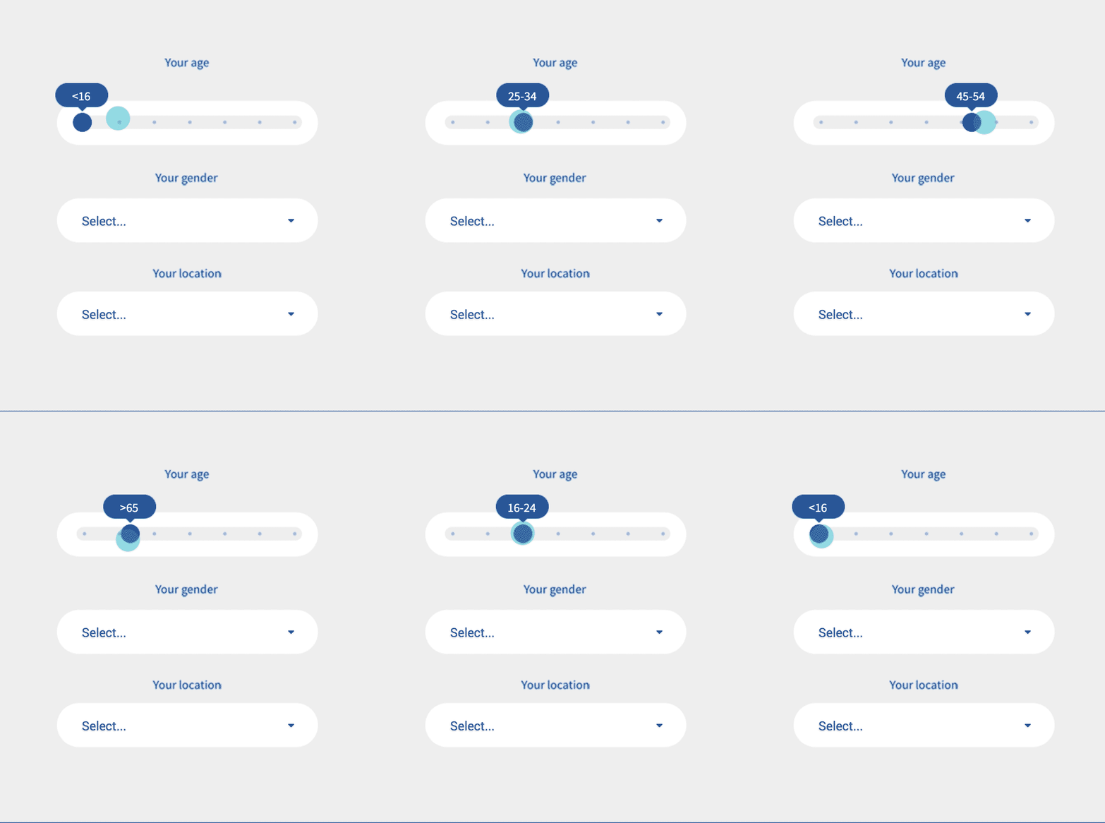
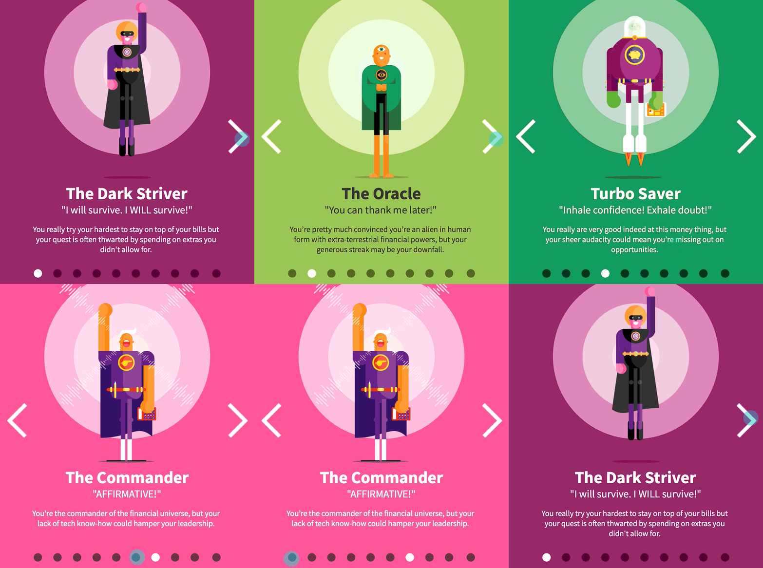
Furthermore, I found the default interaction library within Justinmind to be insufficient. In particular, the stock carousel and slider widgets needed to be designed and built from scratch using a series of hotspot zones and interaction rules.
You can test the prototype for yourself here.
