CONDE NAST CHECKOUT FLOW TOOL
PROJECT:
Checkout Flow tool
CLIENT:
Conde Nast
DATE:
Q1 2023
SKILLS:
State Transitions Mapping
Concept Generation
Figma UI Design
Guerilla Testing
INTRODUCTION
During 2022 and early 2023 I contracted at Conde Nast, where I designed several tools for their Martech vertical. This case study relates to the 3rd product I designed – a tool to enable marketing managers to create and manage on-site subscription checkout flows. Until this point this had been configured by Product on behalf of Marketing.
As the number of brands and markets being served by internal tools was due to scale rapidly, this approach had become unsustainable and therefore a self-serve solution was required. Under tight time pressure I delivered a comprehensive redesign with state transitions mapped and options for post-release enhancements.
CHALLENGES
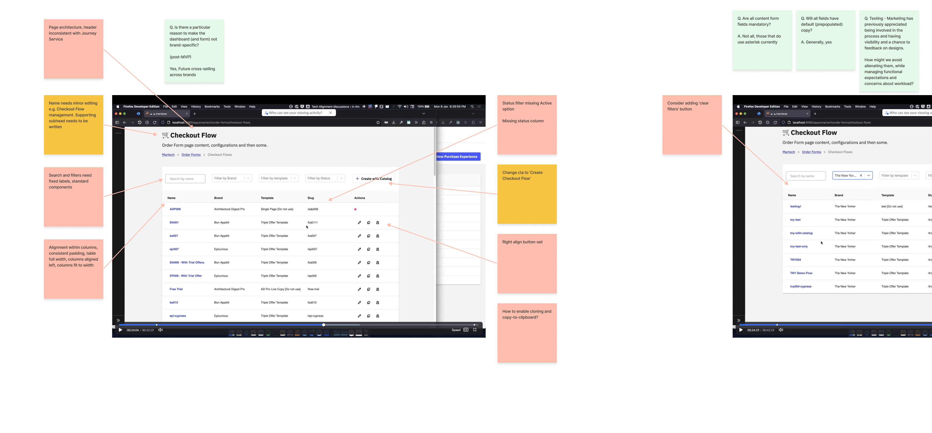
- The current product had no design input and consisted of an ultra long, 1-page form embedded within a campaign configuration
- There was no way for a user to gain oversight of all the existing checkout flows for their brand
- Checkout flows had no explicit state controls
- Reusing Checkout flows on newly created campaigns was inefficient – a user had to know and navigate to the campaign it was sitting inside of, then copy and paste its URL into the new campaign
- The PM wanted to launch as soon as possible. I was given a 3 week deadline to redesign as a new standalone tool, but without any scope to change back-end services.
- I also couldn’t affect the content form design itself. These fields were generated by another tool used by engineers and redesign was out of scope.
- The PM was also insistent that the future Marketing users (who were also project stakeholders) should not be exposed to the tool before being trained. As a consequence I was restricted to running guerrilla testing
APPROACH
Having already delivered multiple products for this vertical at Conde Nast, I had built up a good working and documented knowledge of the users, product strategy, engineering capabilities and design system.
Product’s priorities would often change without communication, and therefore I decided to put greater effort into the design phase and providing explicit handover documentation for both engineers and any designers providing support during build.
Process:
- Developer prototype analysis
- Research
- State transitions
- Design & Prototyping
- Guerilla testing
- Internal review
- Handover preparation
DEVELOPER PROTOTYPE ANALYSIS
One of the client’s developers had created a prototype proposition during a WYW-day. I felt it was going in the right direction but needed a lot of work. I set about analysing and annotated issues, amends, research dependencies and design challenges.
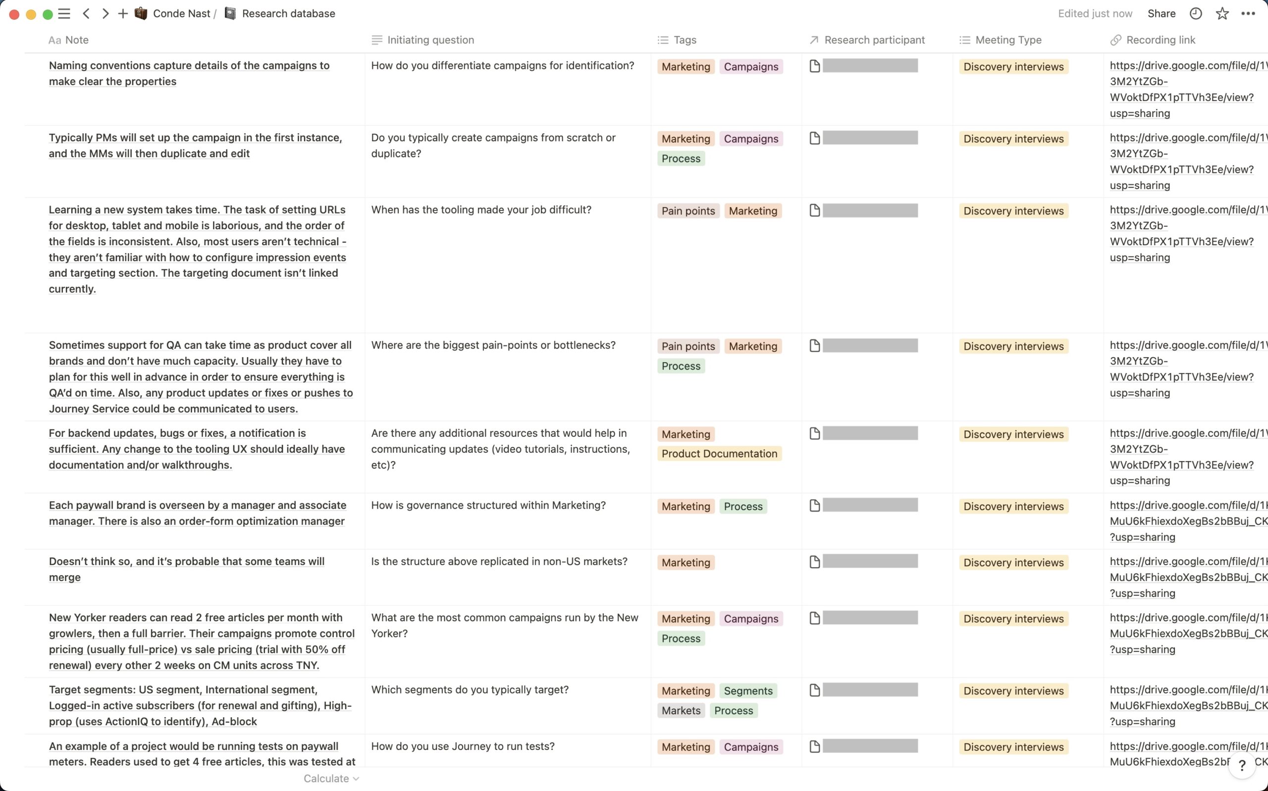
RESEARCH
Given this project would result in a new workflow and set of responsibilities for users, and the limited scope to change functionality the discovery research opportunity was fairly small. From my work on previous projects I had accumulated a large research database in Notion so knew working patterns well. Nonetheless I was keen to ensure user involvement so conducted some light foundational research into their hopes and concerns for the new tool.
STATE TRANSITIONS
Concurrent with the concept development I sketched out a number of options for state transitions, then evaluated. Specifically, I needed to model how and when the system would perform validation for a tabbed design. I was also keen to see how and whether we could accommodate drafting, though this was declared out-of-scope for the MVP.
![]()
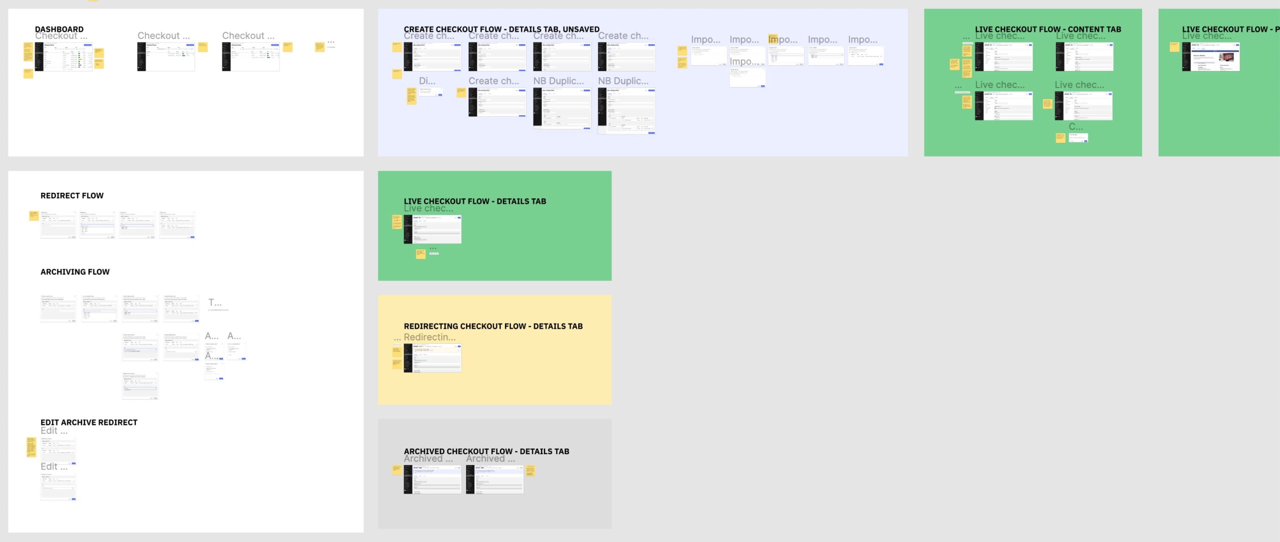
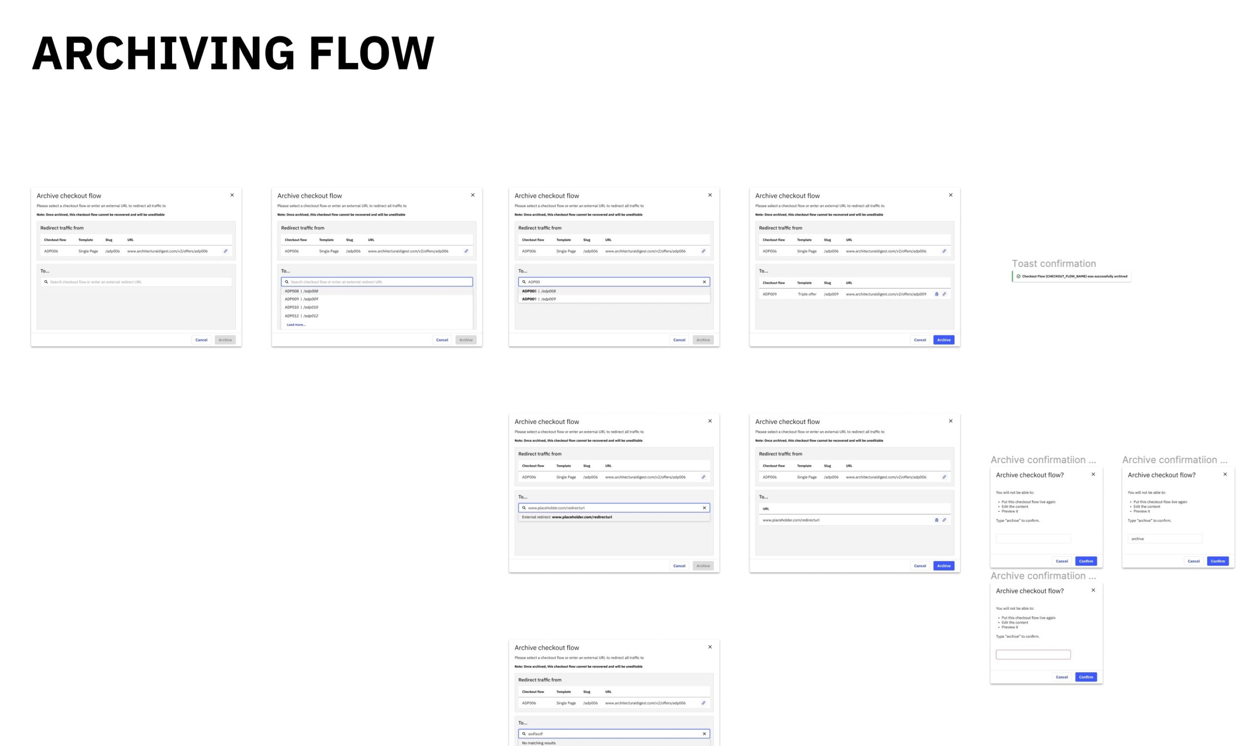
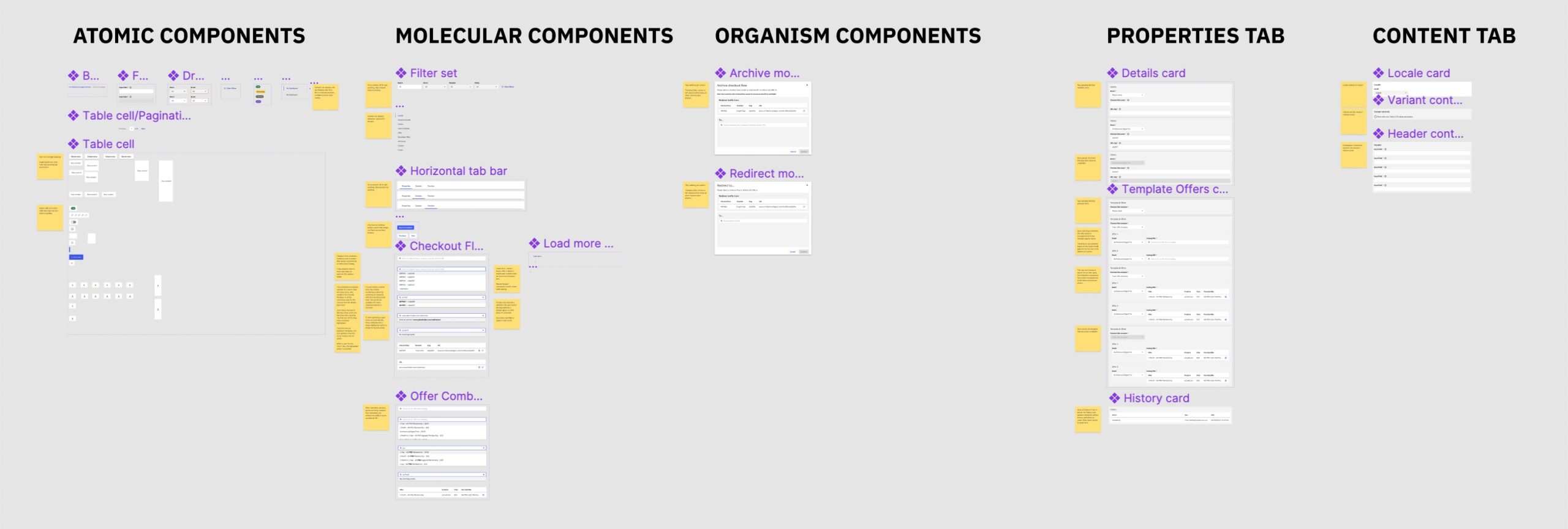
DESIGNS
Working from the original prototype and using the existing design system I created a set of concepts. As ever, I was keen to minimise the use of custom components and ensure consistent, elegant perfectly-resolved interaction design.
The limited scope combined with the rudimentary supporting platform functionality of the old tool meant that a number of workflows required careful consideration:
-
- Engineers had omitted cloning from the original tool, and then had later added an existing-content import workflow as a workaround. The new tool featured a tab design and as such this step needed to be carefully designed to coincide with validation, saving and a state change.
- The design of the transition to Redirecting and Archived states. Existing functionality enabled users to set a checkout flow to temporarily redirect all traffic to another flow, or to archive permanently and redirect traffic to another flow or an external URL. A reusable, efficient combobox pattern was created to handle both cases, and which engineering could adapt from an existing design system component.
These designs were then tested with members of the design team unfamiliar with the project and iterated. The Figma was annotated and specced and presented to engineering on-time.
You can view a prototype of the product at the bottom of this page.