VODAFONE
PROJECT:
V-Auto App
CLIENT:
Vodafone
AGENCY:
Adaptive Lab
DATE:
Q3 2016
SKILLS:
Stakeholder Workshops
User Journey Mapping
Sketch Wireframing
Marvel Prototyping
Usability Testing & Analysis
LINK:
SUMMARY
During the course of 2016 and 2017 Adaptive lab helped Vodafone design, build and launch V-Auto. This was to be the flagship product in Vodafone’s new line of IoT products.
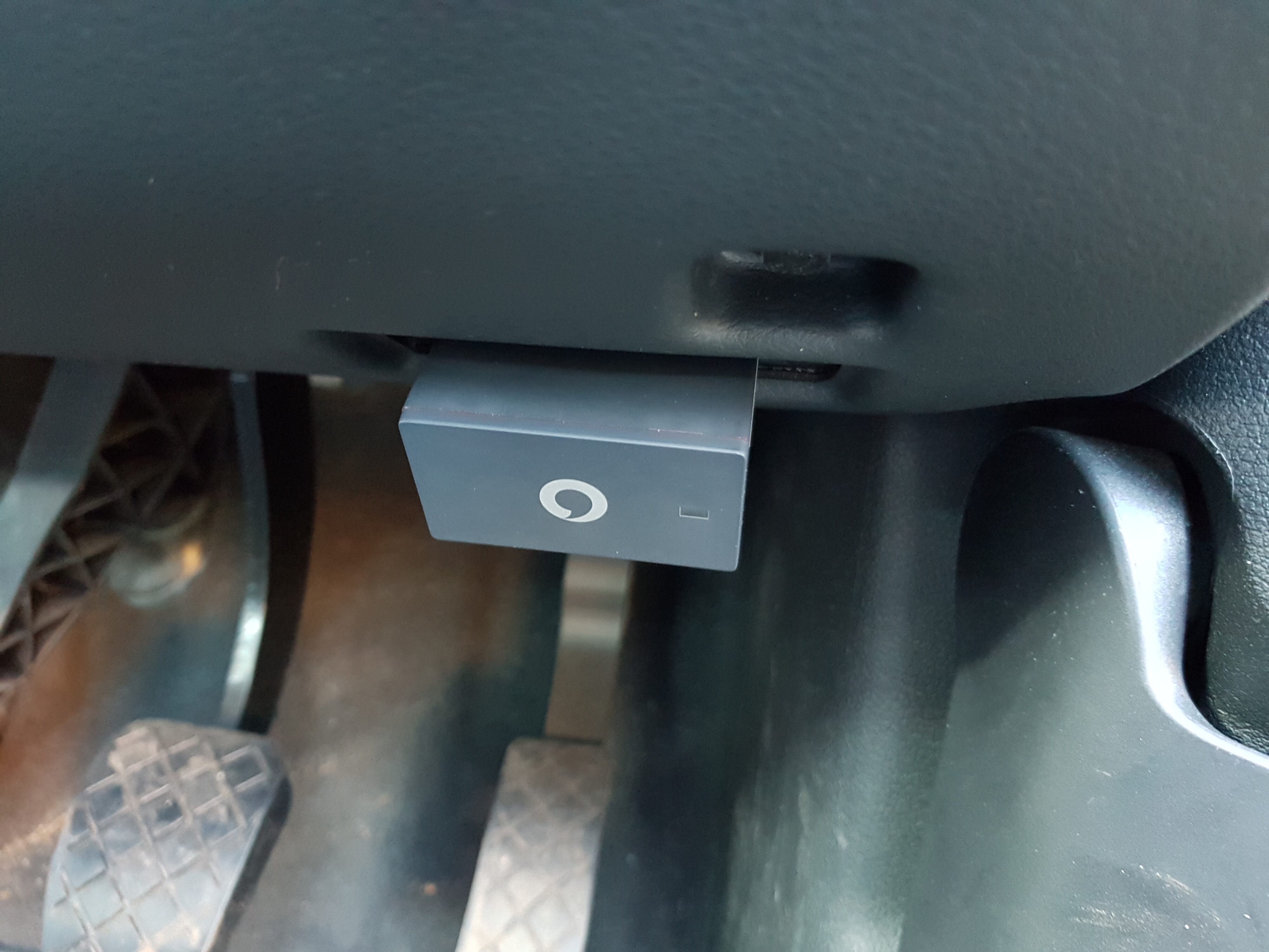
The system consisted of an ODB-port hardware dongle which the retail customer plugged into their car, and an accompanying smartphone app to deliver a connected-car service. This would enable users to track the location of their car, their driving performance and get help in event of an emergency.
ROLE
I joined the project for the 2nd half of the design phase as Senior UX and worked closely with an Art Director and PM. By this time the previous designer had established a way of working with the client and I was brought in to take over and finish the work.
My activities involved enhancing the existing user journeys, creating new journeys and then designing platform-agnostic wireframes. I also presented back to the client on a weekly basis, planned, moderated and analysed user testing sessions and prepared materials for client handover.
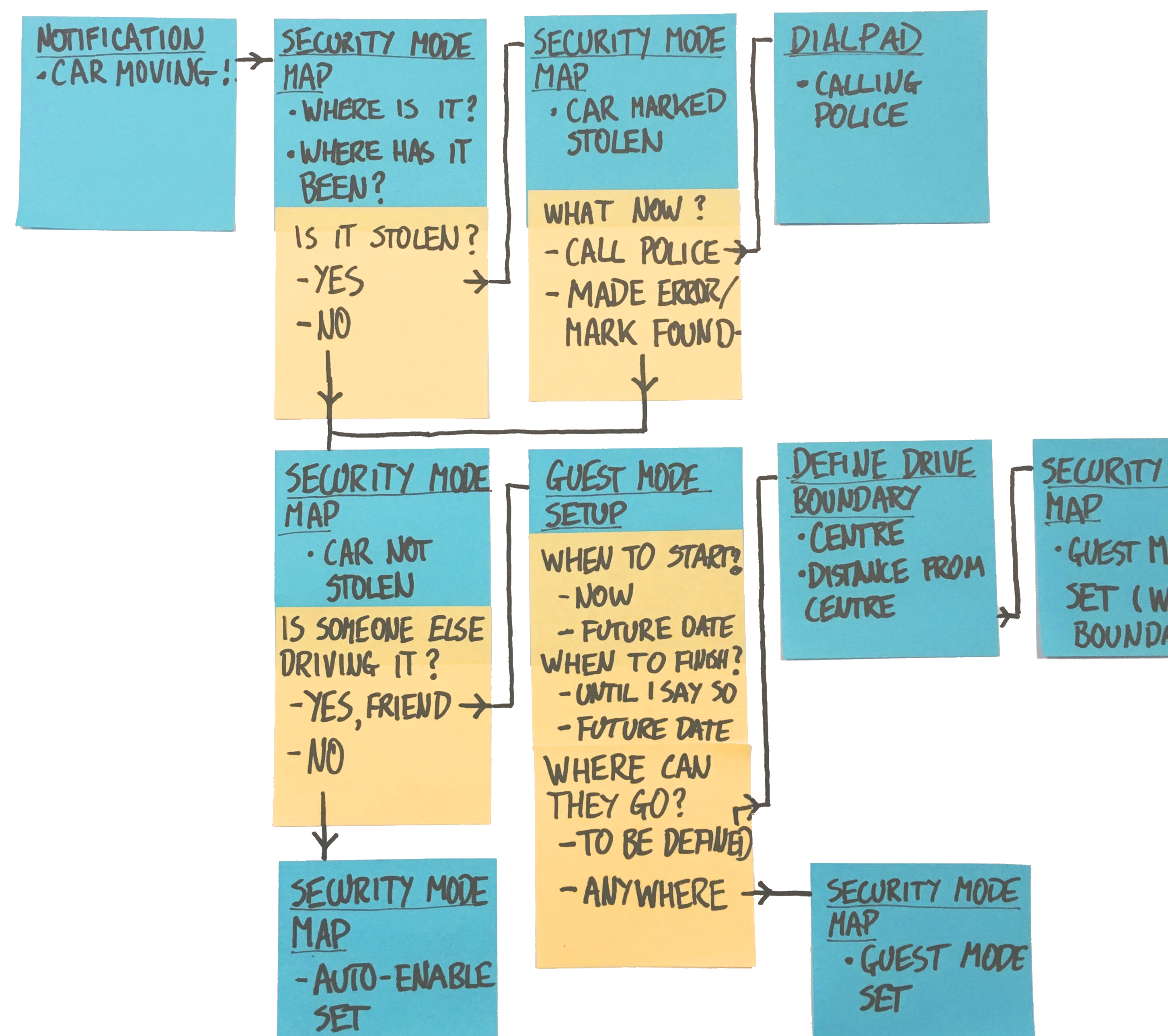
USER JOURNEYS
When I joined the project the client already had a backlog of high-level user stories to work from. These stories formed the basis of weekly workshops where we would unpack and develop them further for each user of the service. I then created user journeys for each story, aiming to minimising the number of steps for task completion while presenting simple, clear decision-points to the user.
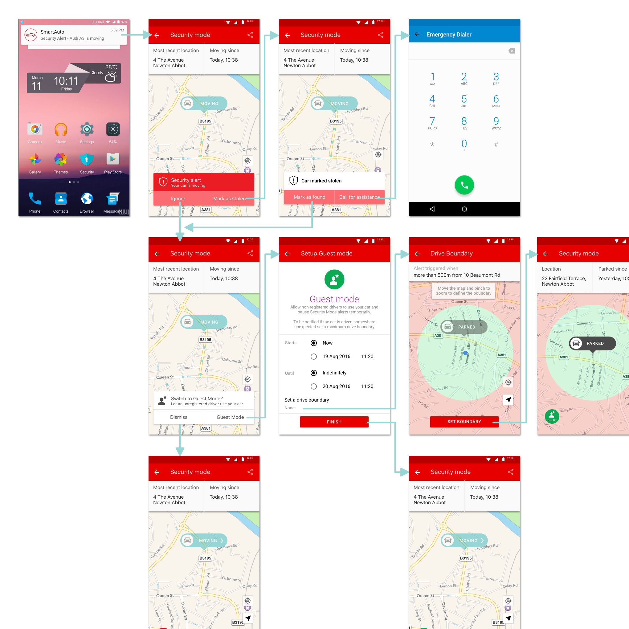
WIREFRAMING
These user journeys formed the basis for platform-agnostic wireframes. The client had yet to run any proposition testing, meaning the functional scope was uncertain. This added an extra challenge and meant the navigation design needed to be sufficiently flexible to accommodate additional features.
USER TESTING
After first draft designs for the specified features were complete I prepared scripts and screeners for user testing sessions. Although the value proposition had never been tightly defined by the client, we were keen to ensure the test sample corresponded to the target market. I ran the testing sessions myself, using a combination of Marvel and Lookback to facilitate and record. With the help of the PM I then analysed the findings and made recommendations to client. The designs were iterated, taken into testing again and then handed over to client.
CHALLENGES
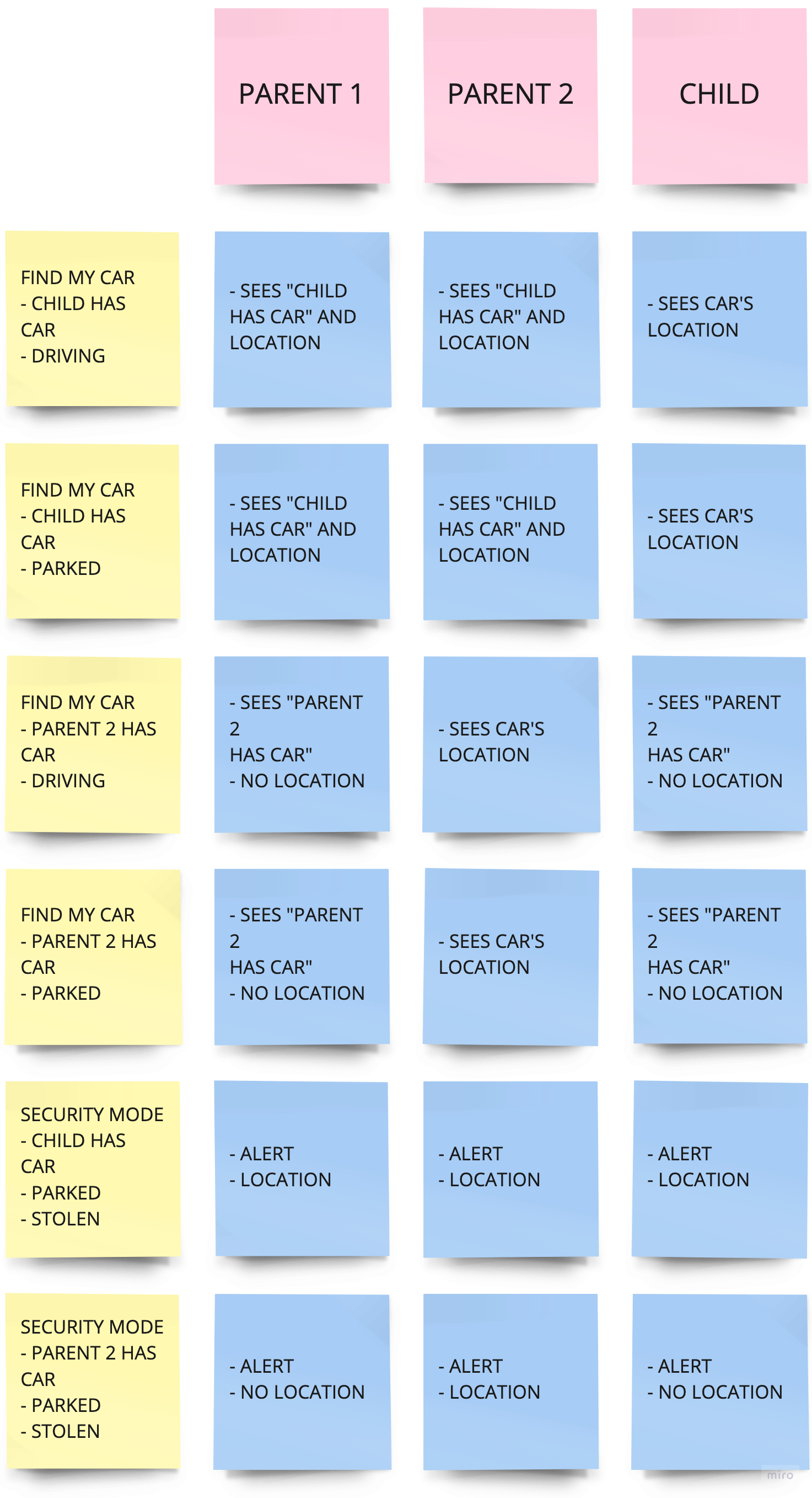
This project had many challenges, in part due to some cultural differences with the client. An example of this was when we were trying to establish the balance between an individual’s right to privacy with the desire to provide peace-of-mind to families. We were conscious that there was the potential for the service to be abused or to cause conflict to escalate within families when tracking the location of vehicles.
SOLUTION
To tackle these issues I mapped out and developed a permissions hierarchy indicating the visibility for each user level for a given scenario. These scenarios were then used to inform the user testing sessions and the findings from those sessions enabled us to steer the client towards a less controversial and more marketable product.


